Granger Causality and Cross-correlation in Python: Why Data Science is a Science
I’ve heard from some of my peers that data scientists shouldn’t be calling themselves “scientists”. Every time I’ve heard this, I’ve respectfully disagreed. Someone doesn’t have to be wearing a lab coat surrounded by beakers and graduated cylinders to be considered a scientist. What is a scientist but a professional who uses the scientific method to prove or disprove hypotheses? In this post, I’ll be showing how data science is a science by using the scientific method to test our hypothesis: that the VIX index serves as a predictor of FDI (Foreign Direct Investment). The null hypothesis, then, is that there is evidence that VIX does not “cause” FDI.
VIX and FDI Causality Analysis
Some background: the VIX market index was developed by the Chicago Board Options Exchange to track market uncertainty. It measures the market’s annualized implied volatility over the next 30 days. The VIX index’s 52-week high for each year will be used for all calculations because taking the average yearly price of VIX makes it difficult to discern when a significant systemic shock has occurred. VIX is a forward-looking index calculated with a rolling 30-day window, meaning that in years where global shocks occur, the index can spike and subsequently regress to the mean very quickly. It could also see small consistent rises because of S&P 500 companies’ earnings results, domestic interest rate hikes, as well as other microeconomic factors across the stock market. This analysis is intended to elucidate the impact of global shocks on FDI, not the impact of general stock market volatility – when there is a large systemic shock, VIX will rise violently to peak levels.
If the relationship between VIX’s year high prices and FDI were correlated to a significant degree, that would suggest that the Canadian economy is susceptible to sudden changes in volatility.
Taking the VIX index monthly-high values over a 22-year period (1999-2021) and using Tableau to visualize the data gives us this model:
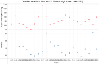
It may be difficult to see a relationship in the above Tableau model without using statistical analysis techniques to interpret the data due to the inherent time it takes for factors like a global shock or even market uncertainty to ripple through the economy and impact an investment as significant as FDI. To confidently interpret the data, statistical tools are used to analyze linear time-series with a time-lag, such as a Granger causality test.
Granger Causality Test
Developed by prominent statistician Clive Granger, a Granger causality test is a statistical analysis method intended to determine if one variable is a reliable predictor of another, even if their effects suffer from a time lag. To determine if market volatility is a predictor of Canadian FDI levels, or if the reverse is true, the Granger causality test will be used to compare FDI inflow in Canada to VIX prices. Since the VIX index serves as an indicator for volatility, if FDI is in fact susceptible to volatility, there will be a correlation between the two variables. Therefore, the hypothesis is that VIX serves as a predictor of FDI. The opposite correlation will also be studied to determine if there is a bilateral relationship. The null hypothesis is that there is no evidence that VIX causes FDI. A standard p-value of <0.05 (95%) is required to confidently reject the null hypothesis.
Using Granger Causality to test simply correlation in Python is simple - the less simple part is learning to parse the output and understanding how to draw conclusions from it. To conduct a Granger Causality test, we need to import the usual libraries, but also import “grangercausalitytests” from statsmodels.tsa.stattools.
import numpy as np
import pandas as pd
import scipy.stats as stats
from statsmodels.tsa.stattools import grangercausalitytests
from statsmodels.tsa.stattools import pacf
import statsmodels.api as sm

df1 = pd.read_csv(r'/Users/khalil/Documents/FDI Research Project/CAN_Inward_FDI.csv') #Read in cleaned-up data
df2 = pd.read_csv(r'/Users/khalil/Documents/FDI Research Project/1998VIXANNUAL.csv')
df = df2.merge(df1, how = 'inner', on = 'Year' ) #Merge FDI and VIX data in order to perform granger test with simpler syntax

granger_result = sm.tsa.stattools.ccf(df['Inward FDI Flow'], df['VIX Levels'], adjusted = True, fft= True) #Correlation coeffecients printed by order of time-lag

for lag in range(1,5):
    grangercausalitytests(df[['Inward FDI Flow','VIX Levels']], maxlag=[lag])  #Granger Causality test with shifting time lag
The result of this code block spits out multiple variables, but here’s the result distilled to what we need to determine causality:
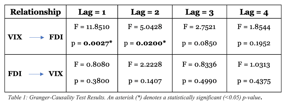
The high F-statistic shows that VIX serves as a predictor of FDI with a lag of 1 and 2 years. The p-value statistic (<0.05) for lags of 1 and 2 confirms that the null hypothesis is rejected with high confidence, further confirming the hypothesis. With a lag of 3 or greater however, the p-value results are not significant enough to confirm causation.
From an economic lens this is intuitive - the more time goes on, the less global shocks from years past will impact new economic decisions, such as the decision to invest in outward FDI. Economist Jeffrey Wooldridge advises a maximum of 2 years of lag used for annual data, as true correlation should significantly decline after. Therefore, the inverse hypothesis - that FDI causes VIX - can also be confidently rejected. It’s always good to see that the results of our data analysis matches our intuition.
Spurious Regression
The Granger causality test resulted in extremely low p-values, meaning VIX likely serves as a predictor of FDI. While the test has become widely accepted in the fields of econometrics and statistics, it is still vital to conduct at least another test to ensure there is no case of spurious regression.
Spurious regression is a phenomenon wherein two independent variables seem to have a significant correlation but are, in reality, uncorrelated. An example of spurious regression is looking at something like McDonald’s daily sales, comparing it to the daily rate of drownings, and saying that when drownings are higher people are more likely to buy Mcdonald’s. I know that’s a bit of a morbid example, but of course drownings don’t cause people to buy more Mcdonald’s - even if the data shows that relationship as being correlated.
To avoid spurious regression, we can employ another statistical equation called cross-correlation to confirm our findings!
Cross-correlation Analysis
import matplotlib.pyplot as plt

cross_corr = sm.tsa.stattools.ccf(df['Inward FDI Flow'], df['VIX Levels'], adjusted=True, fft = False)
f,ax=plt.subplots(figsize=(14,3))
ax.plot(cross_corr)
In writing the code for cross-correlation, the most helpful way to draw insight from it isn’t to print a list of correlation coefficients for each lag (although you could do this if you really want, but good luck explaining the numbers to anyone).
ax.axvline(np.argmax(cross_corr[0:4]),color='r',linestyle='--',label='Peak Correlation')
ax.set(title=f'FDI <> VIX\n Cross-Correlation Analysis',ylim=[-1,1],xlim=[0,4], xlabel='Time-Lag (Years)',ylabel='Correlation Coefficient')
ax.set_xticks([0,1,2,3,4])
ax.set_xticklabels([0,1,2,3,4])
plt.legend()

plt.axhline(-1.96/np.sqrt(len(cross_corr)), color='k', ls='--')
plt.axhline(1.96/np.sqrt(len(cross_corr)), color='k', ls='--')
The command ax.axvline() draws a vertical line (hence the ‘v’ after ‘ax’), and the nested np.argmax() function returns the maximum value between the given array (cross_corr between the 0th year lag and the 4th year lag). All in all, this returns a vertical dotted (linestyle = ‘–’) red line (color=’r’) at the peak correlation.
The next line is self-explanatory - setting the title, y-axis limits (correlation can be highest at 1, meaning perfectly positively correlated and lowest at -1, meaning perfectly inversely correlated) and label, and the x-axis limits (we’re only looking at lags up to 4 years) and label. We then set the tick values on both axes.
Here’s the result of our code, creating a very easy to read and visually appealing visualization!
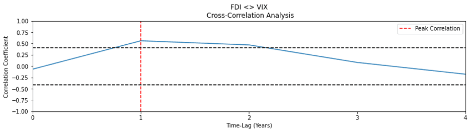
The cross-correlation analysis shows that the only points at which VIX and FDI cross-correlate at a significant level are at a lag of 1 year, where the cross-correlation coefficient is equal to 0.56, and a lag of 2 years, where the coefficient is equal to about 0.47. Evidently, the hypothesis appears to be reinforced as peak causation occurs at a lag of 1 in both the Granger Causality and cross-correlation tests, with a lag of 2 remaining significant to a smaller degree of confidence.
Calculations:
In case you’re a stats nerd like I am and would like to see the equations behind the magic, here you go:
Granger Causality can be defined by the equation:
Where:
Cross-correlation can be defined by the equation:
This is the cross-correlation equation of a discrete finite series.
To determine where cross-correlation values are significant, the equation 1.96/(√n) is used and a critical value of 1.96 is used indicating a 95% confidence interval.
And, in case you were truly statistically curious:
VIX Formula:
Where:
Conclusion:
The benefits of FDI are well-documented and highly touted by the Government of Canada as well as other proponents, but with widespread acceptance comes an important need to understand the risks. Despite being a relatively new form of investment, FDI has become entrenched in the Canadian economy, making it increasingly difficult to decouple it from the nation’s GDP without pulling the rug out from under the Canadian economy. While FDI is a boon for economic growth in the short-term, the fact that it accounts for a significant portion of the nation’s GDP effectively leaves the domestic economy at the whim of the global marketplace, creating an environment that is markedly and evidently susceptible to global volatility.