A Short Python Tutorial For My Favourite Visualization: The Exploding Pie Chart
So, you want to make a Pie chart - but you obviously want it to be more impactful, more interesting, more pizzaz.
Here’s what I propose: make that thing explode.
Daunting at first? Sure. But I’ll show you how. It’ll be easy and short, which I promise will be a nice break when you see how long I plan on making my next few posts.
As an example, I’ll use the exploding pie chart I made for my thesis on Canadian FDI, as well as show the code behind the scenes.
First, import all the classics and read in your csv, assigning it to a variable. This is basic for a Data Scientist, as I’m sure you well know.
import pandas as pd
import numpy as np
import matplotlib.pyplot as plt

FDI_composition = pd.read_csv(r'/Users/khalil/Documents/ResearchProject/FDI_country_composition.csv')
Next, to make the next steps easier (and to make things easier to read for the poor subsequent code-reviewers), seperate the column with numerical values from the column with labels.
country = FDI_composition['Country']
FDI_composition["Value of FDI"] = FDI_composition["Value of FDI"].astype(float).replace(",", '', inplace = True)
FDI = FDI_composition["Value of FDI"]
If you have a keen eye, you’ll notice I unnecessarily set the inplace() function to “True”. This is the default setting and there is (usually) no need to write it out, but it may be important to understand it. When we use something like a replace() function, in order to actually replace the terms in question (in this case, I wanted to get rid of comma seperators) with the given parameters, and not just create a new set of values, inplace must be set to true.
Rant over. This is where it gets fun - put your creative hat on!
explode = (0.1, 0.1, 0.1, 0.2, 0.2, 0.3, 0.3, 0.3, 0.3, 0.2)

colors = ("red", "grey", "teal", "green", "deeppink", "chocolate", "darkseagreen", "lightcoral", "tan", "orange")

wp = {'linewidth' : 1, 'edgecolor' : "black"}
Use the “explode” variable to set the levels of “explosion” you would like to see for each label in your data. Don’t worry, this step will make more sense soon when we call on this variable in the next code block. Similarly, for each label you’re going to want to use a distinguishable colour. Assign a set of colours to the “colors” variable. It’s harder than it looks - the more labels you have, the more difficult this step may be.
You should (and likely will need to) tune the colours and exploding proportions after your chart is built. Now, for the meat & potatoes:
def epie(pct, allvalues):
    absolute = int(pct / 100 * np.sum(allvalues))
    return "{:.1f}%".format(pct)

fig, ax = plt.subplots(figsize = (11, 8))

wedges, texts, autotexts = ax.pie(FDI, autopct = lambda pct: epie(pct, FDI), explode = explode, labels = country, shadow = False, colors = colors, startangle = 90, wedgeprops=wp, textprops = dict(color = "black", weight = "bold"))
This is the tough part. We want to define a function which takes two arguments: pct get introduced in the “ax.pie()” lambda function (sort of like a self-made mini-function), and is intended to calculate the numerical columns as percentages with respect to each other. To do this, the lambda function calls the epie function and gives its second argument - “allvalues” - the values in the FDI column. The “absolute” variable then does the heavy-lifting and calculates individual percentages with respect to the total sum of values.
The epie function then returns the result, to 1 decimal place.
The comman ax.pie() also calls upon that previously mentioned explode variable (told you), as well as the colours. There are many arguments ax.pie() can take, so I’d encourage you to look into the documentation and see the vast breadth of things you can do with it. Using “fig, ax” is, as I’m sure if you’re reading this you already know, used to build the base of a content-less pyplot.
Now that the mathematically heavy part is over (yes it’s over) you can breathe a sigh of relief because you’re almost done.
#ax.legend(wedges, country, title = "FDI Composition by Country", bbox_to_anchor = (1, 0, 0.5, 1))
plt.setp(autotexts, size = 9, weight = "bold")
ax.set_title("Canada's Inward FDI Composition By Country \n Source: Statistics Canada", color = 'black')
plt.show()
I personally didn’t use a legend as I preferred having the labels directly on my chart, but feel free to if it brings value to your visualization. “bbox_to_anchor” dictates the location of the legend, while I used the “setp” and “textprops” functions from matplotlib (see previous code block) to show the text in the pie chart itself.
Finally, plt.show() makes your exploding pie chart real!
Here’s mine!
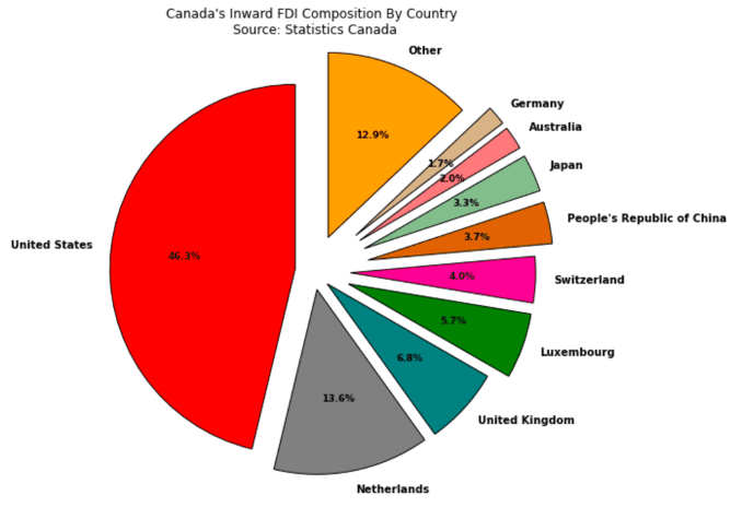
While it may be my favourite type of visualization, I totally get if you’re not as excited about it as I am. But you gotta admit it’s kinda cool right? It’s also really not too hard to grasp!
Another post I can’t wait to write is about my process on deciding which statistical correlation technique was the right choice to use. Spoiler: I decided on a Granger Causality and CCF Analysis, but first I went through Pearson, Kenneth, and Spearman correlation coefficient equations. It turned out there’s a lot more ways to test for correlation than I thought.
It may need to be broken up into two posts (look out for the Granger Causality one, it’ll be a doozy), but hopefully I can get that up soon!
Signing off,
Khalil (TheStatsGuy)